Animated expand icon button – plus to minus – Angular 2+
digitalkoi
- posted on
- No Comment
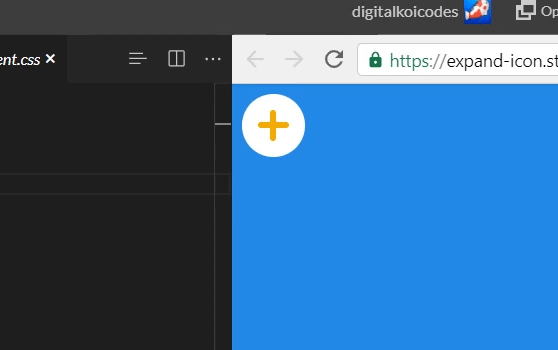
Working with angular material expansion panels, we found ourselves wanting to replace the default carat icon with a plus. Looking around at different options we decided on replacing it with a plus that spins into an x.
We did that, it looked alright.
“Can we make that a minus?”
“Sure”
So we replaced it with a plus icon that switches to a minus icon. No animation. It’s just not the same. How can we animate a plus to a minus?
I find this: https://stackoverflow.com/a/38136146
The idea is to make a plus sign with 2 html elements, one full width and one full height; then absolutely positioned to offset them to center. I want to take this idea and turn it into an angular component. So let’s get into it..
Alright so our component declaration comes first
import { Component, Input, Output, EventEmitter } from "@angular/core";

@Component({
  selector: "koi-expand-button",
  templateUrl: "./expand-button.component.html",
  styleUrls: ["./expand-button.component.css"]
})
export class KoiExpandIconComponent {
  @Input()
  public expanded: boolean;

  @Output()
  public expandedChange: EventEmitter<boolean> = new EventEmitter();

  public toggle() {
    this.expanded = !this.expanded;
    this.expandedChange.next(this.expanded);
  }
}
Input and Output on a variable called “expanded”, this will let us know when it’s expanded or not. Declaring and input and then an output with the same name but ‘Change’ on the end allows us to 2-way bind the data from parent component to this component. A toggle function to emit the even when it changes.
Next the html.
<button (click)="toggle()" [class.expanded]="expanded">
  <span></span><span></span>
</button>
Very simple, 1 button and 2 spans. The 2 spans serve as the vertical and horizontal lines of the plus sign, and we’re going to rotate them as soon as the class expanded is added on.
So let’s make it all come together with some css.
button {
  background: white;
  width: 50px;
  height: 50px;
  border: 0;
  border-radius: 50%;
  font-size: 1.5em;
  position: relative;
  outline: none;
}

button span {
  position: absolute;
  transition: 0.3s;
  background: #edad00;
  border-radius: 10px;
}

button span:first-of-type {
  top: 25%;
  bottom: 25%;
  width: 10%;
  left: 45%;
}

button span:last-of-type {
  left: 25%;
  right: 25%;
  height: 10%;
  top: 45%;
}

button.expanded span:first-of-type,
button.expanded span:last-of-type {
  transform: rotate(90deg);
}

button.expanded span:last-of-type {
  left: 50%;
  right: 50%;
}